
Most coverage of decentralised finance tracks which protocols launched, which chains gained users, and which strategies paid the most over the past month. That view is useful for knowing what exists, but it tends to skip the question that matters more for anyone deploying capital, which is where the money has settled and how tightly it gathers around a handful of venues.
Capital in DeFi is distributed unevenly, with a small number of protocols holding most of it in each part of the market. The shape of that distribution determines where risk accumulates and how widely a single failure can spread, so it deserves to be read on its own terms.
This article describes how to read it, sets out the two levels at which capital concentrates, and explains why concentration is best understood as a measurement of how a market works rather than a judgment of whether it is healthy.
How to Read the DeFi Ecosystem: The List and the Map
The usual way to survey DeFi produces a list, which ranks protocols by name, by the assets they hold, and by the returns they advertise. A list of that kind sets out the menu of what an allocator could hold, but it says nothing about what holding any item on it would expose them to, because it describes each protocol in isolation and leaves out the market around it.
A map of the distribution supplies what the list omits. It shows how much capital sits with each protocol, how that capital is divided among the competitors within a category, and how the categories compare in size.
The two views often disagree, because a protocol that looks appealing on the list can turn out to be a small participant in a category that a few larger names already control, which means its real risk comes as much from the venues around it as from its own design. Reading the distribution first places any single choice in the context that decides what it actually carries.
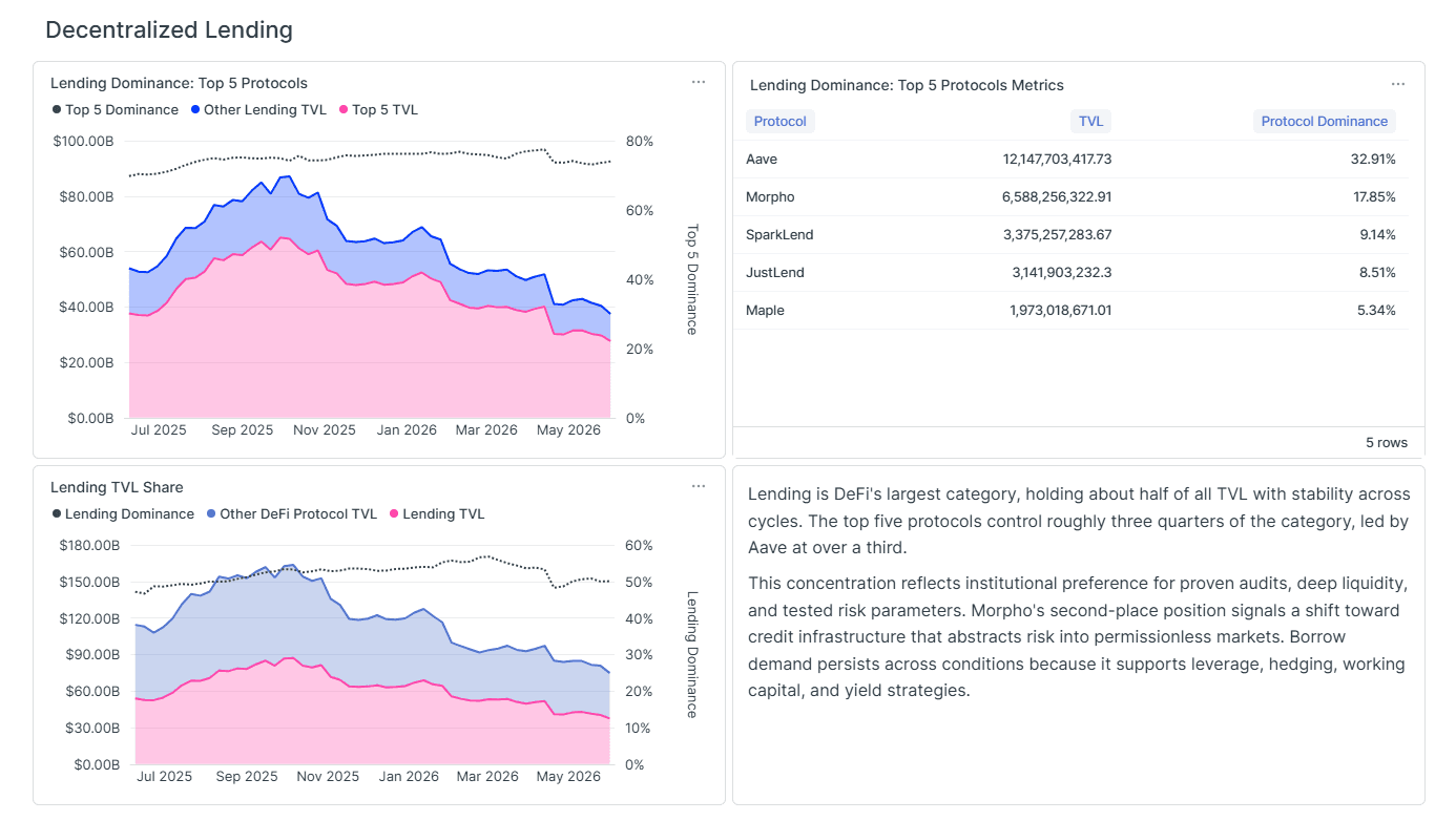
Seen this way, the market resembles a set of pools rather than an even spread. A few venues hold the majority of the capital in each category, and a long tail of smaller protocols divides whatever remains. That structure is what decides whether a problem stays local to one venue or travels across the protocols that depend on it.
You can explore these distributions yourself at the Sentora Crypto Dominance Dashboard to see DeFi as a concentration map.
Why Capital Distribution Carries the Information
Two categories can hold the same total capital and still behave in completely different ways.
When a single protocol holds half of a category, everything else in that category is built on top of it, so if that protocol fails, the whole category fails with it. When ten protocols each hold a roughly equal share, no single failure can take down the category, but the capital is spread across smaller venues that tend to hold thinner liquidity and carry shorter track records, and that carry more risk of their own.
Neither arrangement is inherently safer:
A concentrated category offers depth, well-tested code, and broad integration at its center, with the trade-off that the center carries the load for everyone built on top of it.
A fragmented category removes that single point of failure and replaces it with many smaller ones, each exposed to the particular chain or niche it serves.
A market participant who knows only the protocol names, and not the surrounding structure, has no way to tell which of these situations they are standing in.
DeFi Capital Concentration Measures How a Market Rewards Scale
It is tempting to read concentration as a grade, where a lower figure signals health and a higher one signals danger.
However, the data rewards a more neutral reading, because concentration reflects the kind of advantage a market rewards, and the different parts of DeFi reward different advantages.
Where depth and integration compound, capital gathers around the protocol that has accumulated the most of both, and the category concentrates.
Where the decisive advantage is tied to a particular chain, the category divides along chain lines, and no single protocol leads everywhere.
Both outcomes are sensible responses to how each category works, which is why the useful exercise is to measure concentration and explain it rather than to score it.
Reading the List Alone Has a Cost
Consider a market participant who works only from the protocol list. They find a lending market with an appealing rate and a clean interface, and they deposit into it. The list has told them that the protocol exists and what it pays, but it has not told them that the protocol holds only a small share of a category where a few names control nearly three quarters of the capital, that its rate is elevated because its liquidity is thin, or that the assets it lends against are priced largely by the bigger venues it competes with.
The map does not tell the market participant to avoid the smaller protocol, and depositing into it may well be the right call. What the map adds is an accurate sense of what the position involves, which is exposure to the edge of a concentrated category and to the larger venues that set its terms. In other words, the smaller protocol's rate, its liquidity, and the value of its collateral all depend on names it does not control, and the map makes that dependence visible before any capital is committed.
Reading the distribution first is what turns the deposit from a blind decision into an informed one.
Read as a map, DeFi becomes a picture of where dependence lives rather than a catalogue of opportunities. The same deposit carries one meaning at the center of a concentrated category and another at the edge of a fragmented one, and only the distribution reveals which one applies.
For anyone deploying capital onchain, the discipline that follows is straightforward, since it amounts to reading the shape of the market before reading the rate, because the shape is what determines the risk the rate is paying for.
About the dashboard. The Sentora Crypto Dominance Dashboard is a research tool that measures how concentrated capital is across decentralised finance. For each of the three major categories, lending, decentralised exchanges, and liquid staking, it identifies the five largest protocols and the share of the category that each one holds, alongside the share of total DeFi capital that the category represents. The figures are built from onchain data and refreshed regularly, so the dashboard shows both where capital sits today and how its distribution is shifting over time. It is maintained by Sentora Research.
Explore the live data: https://sentora.com/research/dashboards/crypto-dominance